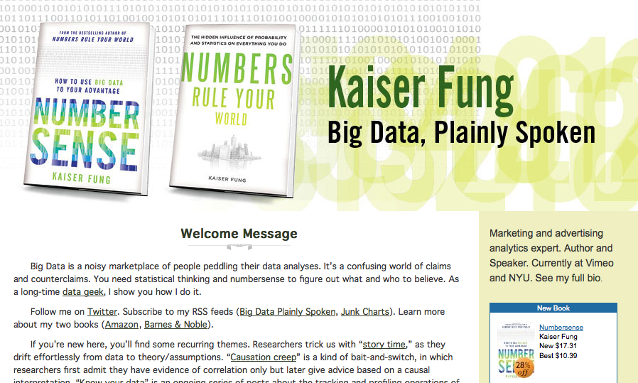
My Blogs
I produce a popular blog on data visualization and analytics. I explore and discuss how quantitative information is conveyed to the public in visual as well as textual formats.
Note: Since October 2025, my blog is hosted at https://www.junkcharts.com. If you go to the old Typepad address, someone has parked the link and falsely claim I’m “closed for business.” Sign up below to receive new posts by email so you can follow me wherever I go.
What People are Saying
“Essential reading in the field”
“One-man crusade against ineffective charts”
“Good clean nerd fun”
“[He] can practically write a book on New York Times’s charting”
“Sets the bar for forensic, balanced evaluation of data visualization designs”
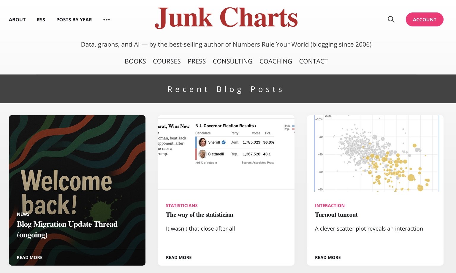
JUNK CHARTS
Recycling chartjunk as junk art
Est. 2005
As the web's first dataviz critic, I take an incisive look at two or three data graphics that get published in the mass media every week. The blog contains an archive of over a thousand charts and graphs, and is a favorite of dataviz insiders. Learn how to edit and improve your charts.
BIG DATA, PLAINLY SPOKEN
Est. 2010
A companion blog to JUNK CHARTS. I discuss mass-media stories that are interesting from a data, statistics, or probability perspective. Recent posts range from steroids testing to Facebook using your name and image for marketing, and from predicting terrorists to fantasy football.